I received free product to facilitate this post — all opinions are my own. This post also contains affiliate links, meaning any purchases made using these links will earn Taz + Belly a small commission. You can read more about our affiliate relationships here.
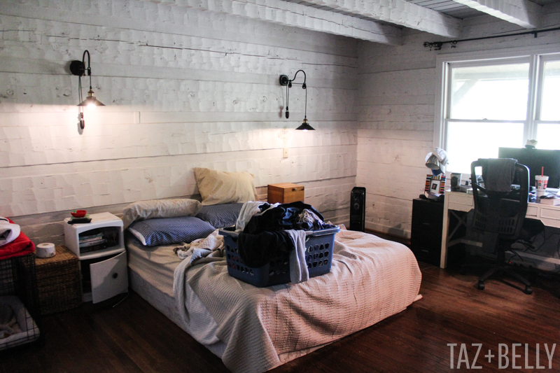
It’s been an entire month since I showed you this embarrassing view of our bedroom, but we have made so much progress in the last thirty days. The last eighteen months in this house have been equally weird and wonderful, but I never imagined it would take us this long to refresh a single room. We knew when we moved in that we wouldn’t be purchasing the house right away and both families fell into a very comfortable routine of enjoying each other’s company and not rushing to make any decisions. The house still hasn’t changed hands and we’re thriving in the midst of this communal living situation — even Josh regularly schemes on how to keep my parents around for a little longer. We have been working on dividing the property and getting ready to make the purchase official, but we’ve had a few hiccups regarding the proposed property lines. It’s a good thing we’ve all learned to go with the flow! Since we’re buying from my parents and the updates we’re making won’t really affect the purchase or its price, we decided to move ahead with some of the easier (read: less expensive) projects while we wait to finalize our mortgage.
Remember when this room looked like this?
Here’s an almost identical view, just a few weeks later! Although the walls look warmer in the photograph below, we actually lightened them up quite a bit by painting every surface in Sherwin Williams’ Snowbound. We’re not sure the textured walls really call for expensive paint, but we decided to use this room as a trial run and see what we thought about the color and quality of the paint. The color was a huge hit, but we’re going to have less expensive paint color-matched for the next space, just to see how things stack up. Heavily textured walls hide so many of the imperfections already, so we’re not eager to spend thousands of dollars in paint over the next six months.
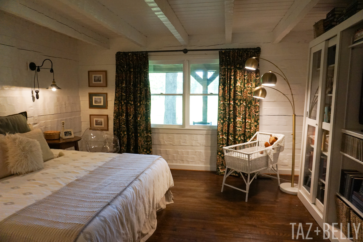
Our plans for this room were to upgrade our bed and mattress (hallelujah!), build a curtain rod out of cast iron pipe, retrofit these vintage curtains and give our “built in” bookcases a facelift. We accomplished most of that in the span of two weekends, but it’s taken a few more weeks to get all of the details just right. We will eventually refinish all of the hardwoods on the first floor – we’re thinking about stripping them completely and applying a matte finish clear coat – but in the meantime we’re shopping for an oversized rug that will clean up nicely and won’t compete with the curtains. I think we might also add a bench to the foot of the bed, if we can find something we like. The space between it and the bookcases is much larger than it appears in these photographs.
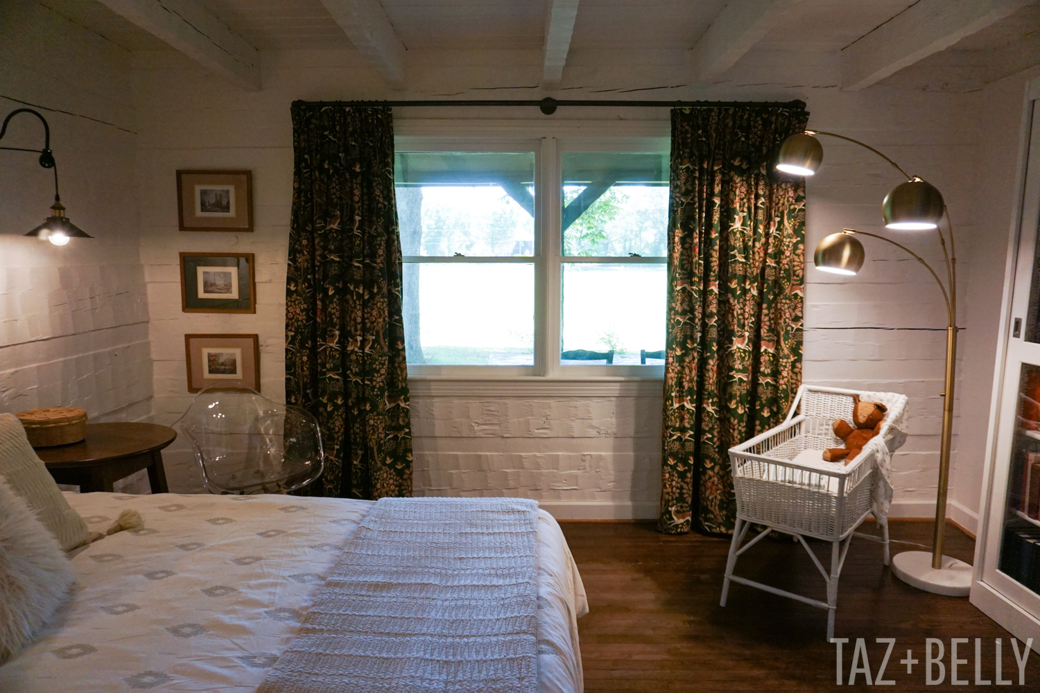
This corner regularly holds the dog’s crate, but I’m trying to find a new home for it or figure out the best way to camouflage it or turn it into a bedside table for Josh. These prints were in our bathroom at the Rock House and are postcards that I bought in London, for my parents, when I was fourteen years old. My mom had them mounted with colored mats and pine frames and they work perfectly with the curtains in our room.
Speaking of curtains, these are conversation starters, for sure! They used to be conference room curtains in the law office where I work, but were on the chopping block during a design refresh many years ago. My mom hemmed them a few weekends ago (they were almost 12 feet long!) and we still have plenty of fabric left over for accent pillows. They are the perfect green color — that we’re hoping to repeat on all of the interior doors on the first floor and our kitchen cabinets — and have the most fun hunting theme filled with dogs, deer, and trees.
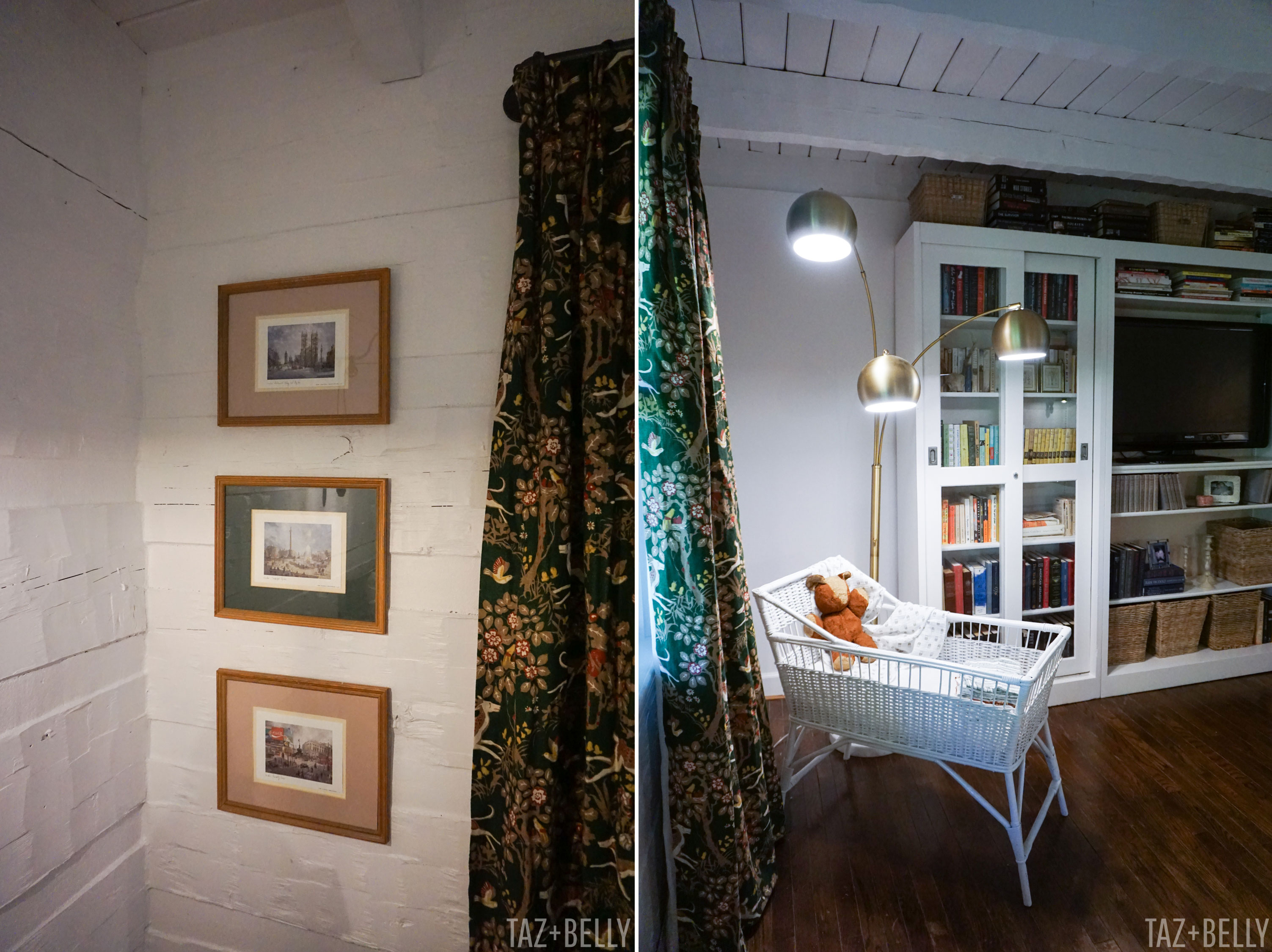
I can’t remember if I’ve shared the bassinet before, but it’s a vintage wicker bassinet that my great aunt loaned to my sister, and I’ve since borrowed it for baby to sleep in until he or she moves up to the nursery. Josh joked about how he didn’t like it so close to his side of the bed, so it might eventually get relocated, but I do love how it looks between the windows and our bookcases.
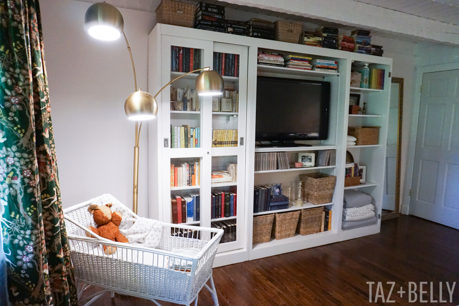
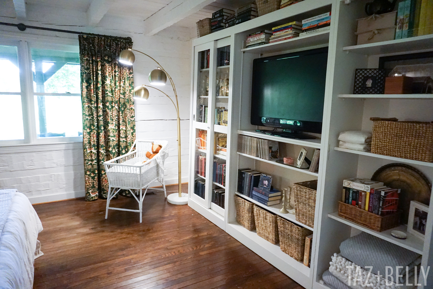
Speaking of bookcases, these are another fun piece of furniture that made the move from the Rock House. They used to be lab cabinets in the girls’ elementary school, but my mom rescued them from the trash right after we got married. They started out in that typical schoolhouse, shiny orange finish, but were very easy to makeover. We’ve since given them another fresh coat of paint, linen fabric in the center section to help cover television and internet cables, and are only waiting for one door to be painted (#pregnancyproblems).
I filled them with books that had been boxed up for months and we were so happy to see some of our favorites come out of hiding! Ella laughed at the way I organized the books — some by color, others by size, and one shelf dedicated to unread titles — but I love how the styling turned out. The books on top will eventually migrate to a new home, but until I figure that out, I’m kind of enjoying them where they are.
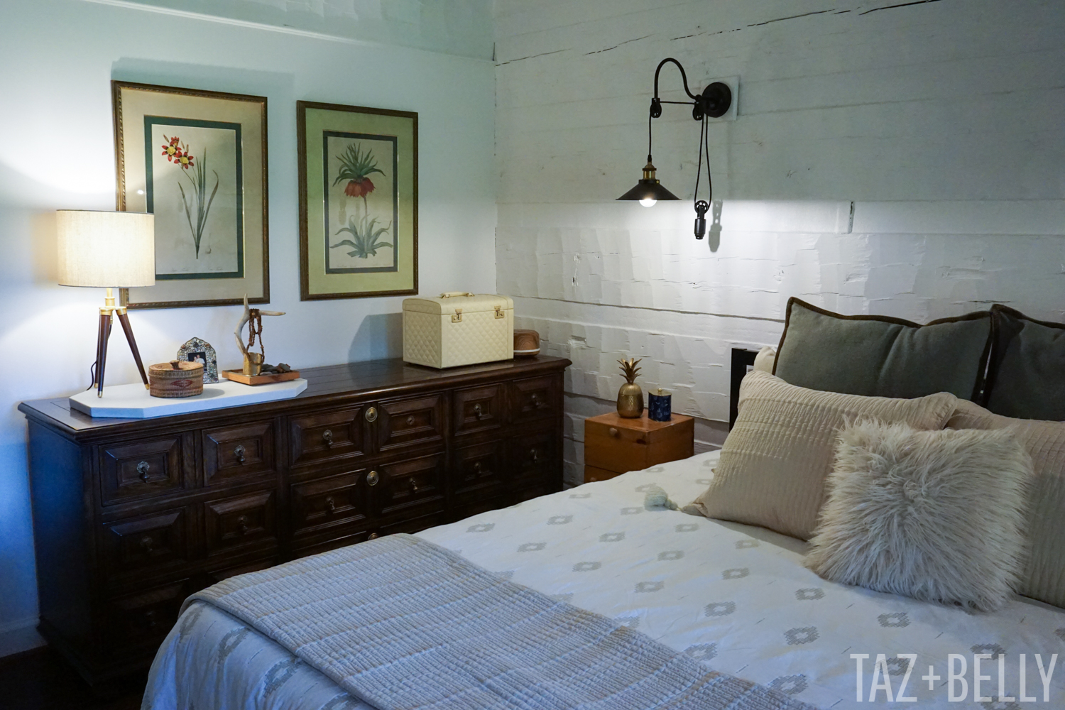
This dresser was in our dining room at the Rock House and a few short weeks ago, it held our television on the wall across from our bed. I was worried it wouldn’t fit here, but we had a few inches to spare on either side and it left me just enough room for a small nightstand and plenty of clearance to open the drawers. The botanical prints are a pair that my mom left behind and since they worked so well with our curtains, I relocated them from the living area.
Now that you’ve seen every angle of this updated space, let me tell you the three changes that made the biggest impact (for us!) in this room.
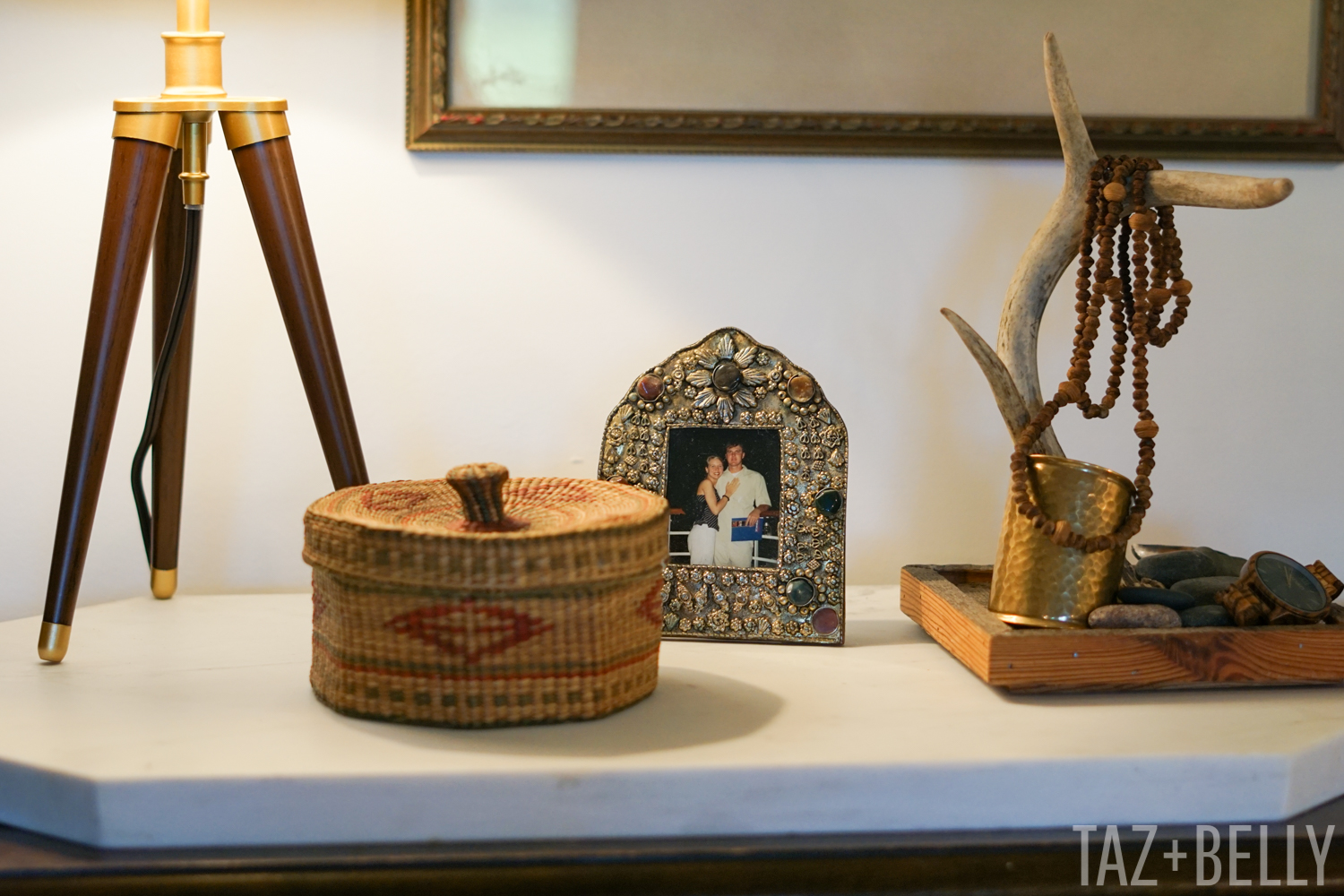
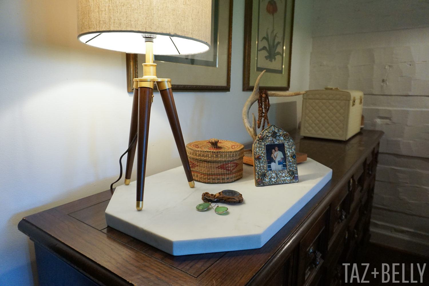
ONE | Our first floor is notoriously dark, since there aren’t many overhead fixtures. The ceiling is open to the floor above and no space in between means very little light in the rooms. Add dark walls and ceilings and you can understand why we were itching to brighten things up. We added a fun floor lamp from a local discount store and this adorable tripod table lamp, courtesy of WikiBuy. Wikibuy operates as a website and a Chrome extension that finds you the best deals across the web on products you love! They don’t actually sell the products, but they do help you find the best deals on the web. I had seen similar lamps all over the internet when shopping for this space, but was able to find the same lamp, for much less, using WikiBuy to help me source it. You can search directly from their site or any of their participating stores to find the best deals on items you are already shopping for.
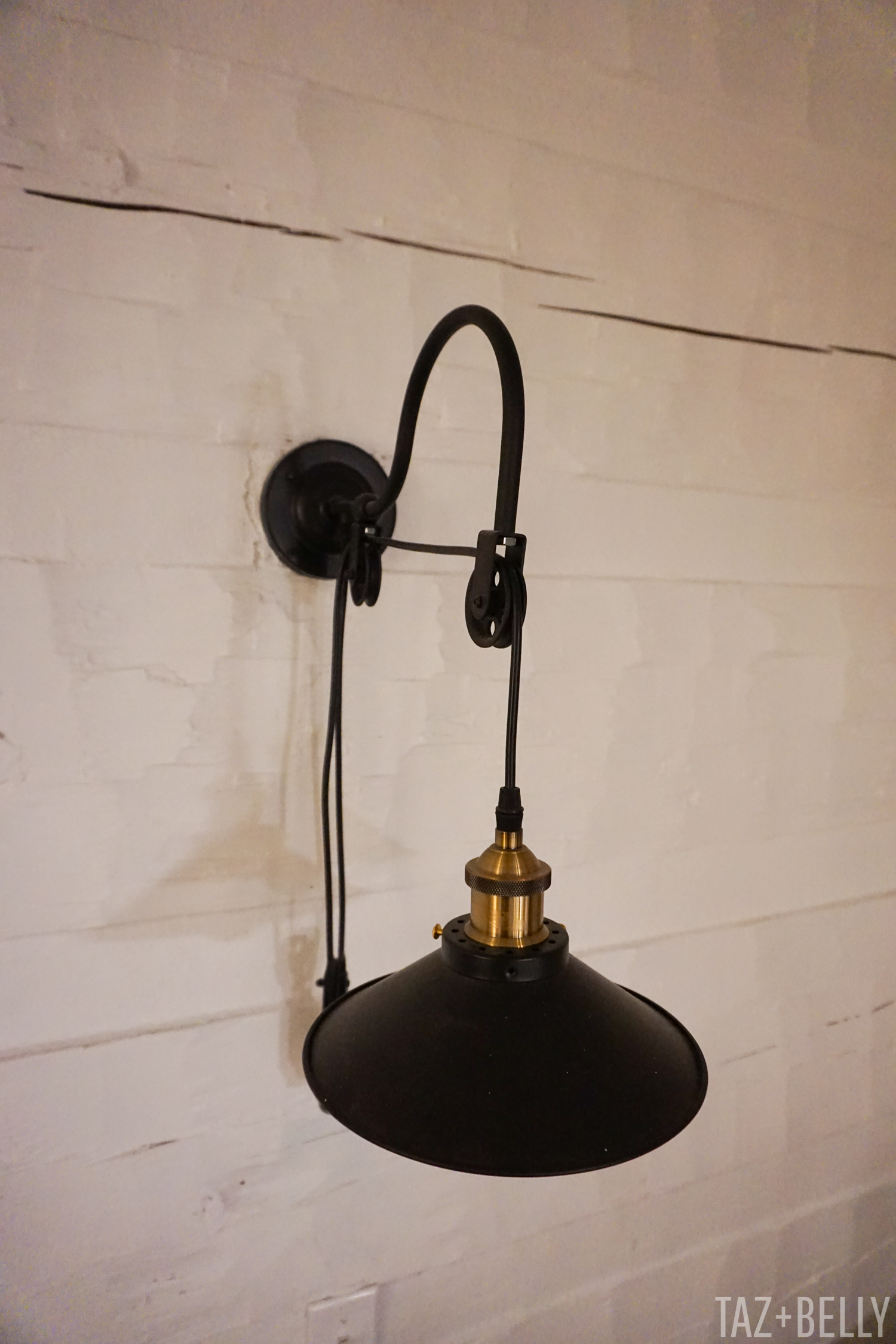
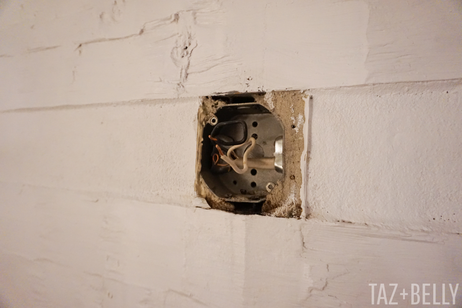
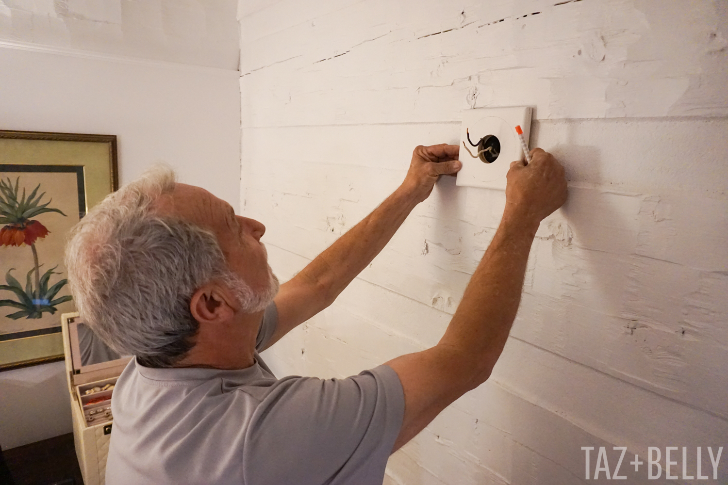
TWO | When my parents lived in this room, they had vintage doors hanging on either side of the bed, with chandeliers mounted to iron brackets. It sounds complicated, but it was really beautiful and just my mom’s style. The downside to this, is that once we removed their fixtures, we were left with big square holes in the chinking between the logs. We hung these farmhouse lights temporarily and even though Josh didn’t think they needed any attention, I couldn’t stand how you could see the imprint from the previous lights. After much debate, my dad made simple wooden plates, that we could mount behind the lights to hide the hole from the previous fixtures. We debated whether or not to paint them to match the wall color or to match the flanges on the lights, but I’m so glad we went with the lighter option. We screwed them directly into the logs and then rehung the lights in their original location.
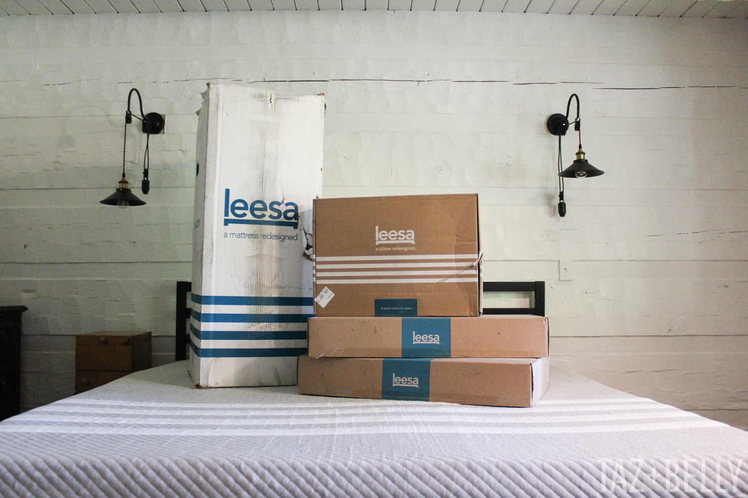
THREE | We were in desperate need to upgrade our bed. When we first got married, we slept on the mattresses from my childhood bedroom and when we moved into the Rock House, my parents bought us new mattresses to welcome us home. They were fine for the recommended seven years, but after sharing our bed with an eighty pound dog for many years after that, we had a severe dip in the middle of our bed and a queen sized spot to sleep just wasn’t cutting it any more. We had already been shopping around for an all foam, king sized option, so when Leesa reached out about collaborating on an Instagram campaign, we were very eager to give their mattress and pillows a try. We talked about building a platform bed of some kind, but we found this inexpensive, steel bedframe on-line and it looks so good with our light fixtures and curtain rods. We’ve been sleeping (very far apart) on this amazing bed for almost a month and I am resting so much better than I ever remember before.

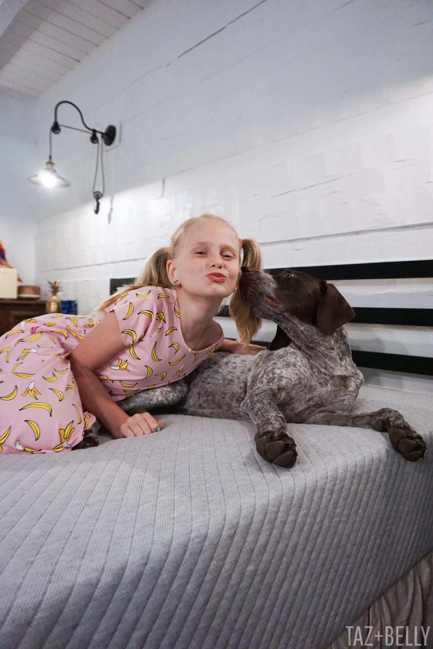
We are not the only ones enjoying our updated bedroom. We can’t seem to keep Scoop off the mattresses and the girls want to have a Survivor viewing party in our bed almost every single night. Transitioning from a queen mattress to a king mattress makes such a huge difference and we can all lay side by side to binge-watch our favorite shows and nobody fights for arm room!
There are a still a few things we want to add to this space and our master bedroom will eventually get an overhaul, so I’m sure there are many more Master Bedroom Updates to come. In the meantime, head over to Instagram Stories and watch us unbox this crazy mattress-in-a-box and save up to $200 on your own mattress upgrade ffor a much better night’s sleep.
Sources: King Sized Foam Mattress c/o Leesa | Steel Bedframe | Farmhouse Style Wall Pendants | Brass + Marble Floor Lamp | Similar Curtain Rod | Ghost Chair | Tripod Table Lamp c/o WikiBuy | Sophie’s Banana Dress
