Disclosure: Affiliate links appear in this post. Any purchases made using these links will earn Taz + Belly a small commission. You can read more about our affiliate relationships here.
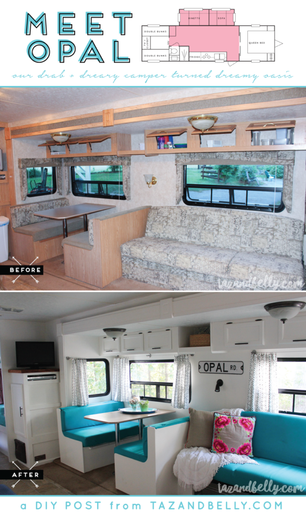
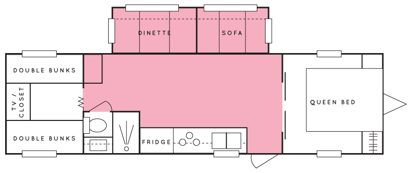
Next up on our camper tour is the living and dining area. These areas make up the bulk of our camper and are all open to the other rooms. To help familiarize you with each space as we talk about it, I’ll include an image of our floor plan in each post — we’re talking about the pink areas below.
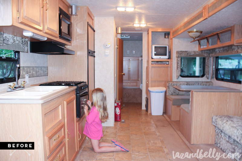
Just like the previous posts in this series, let’s start things off with a few before photos. This is probably the photograph that gives you the best idea of the space we’re working with. I’m standing with my back to the master bedroom and the camper entrance is directly to my left. The bathroom door is open in this photo and we’re looking straight back into the bunkroom. This is also the only photo that shows the entertainment center before we made modifications to it. Because that upper portion was enclosed, and it didn’t have an upper shelf, we had to use a tiny television that would fit inside and we wasted a ton of space.
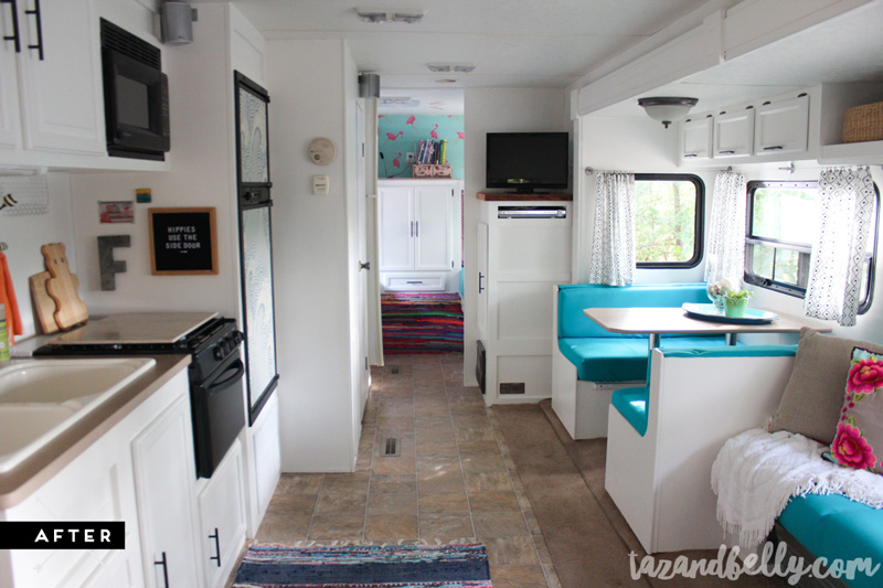
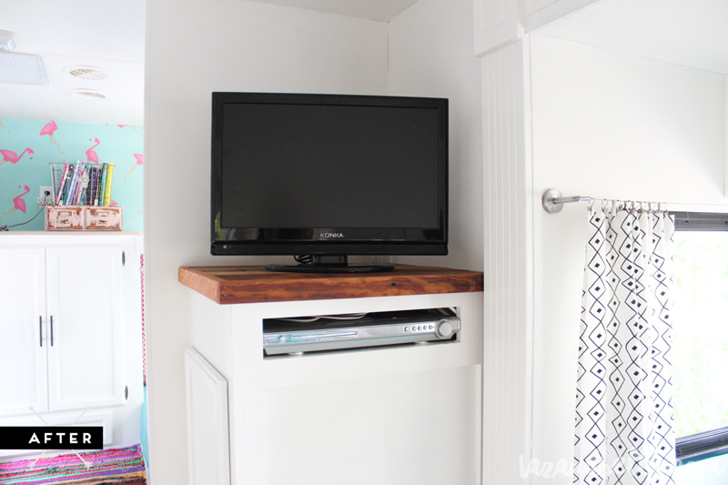
Here is the same angle in the camper today. Can you believe how much bigger she looks with all of those white walls?! You can see here, that we cut off the upper portion of the entertainment center, both to allow for a larger flat screen television (a hand me down from my parents camper renovation) and to open up the hallway between the pantry and the bathroom. It translates much better in person, but it seems so much roomier without that wall!
Here’s another before shot that shows a better angle of the slide out. Both the couch and dinette have storage underneath and they both fold out to make double beds. While we don’t often use these areas for overnight guests, the girls do love laying the couch down to make a pallet for rainy day movie marathons.
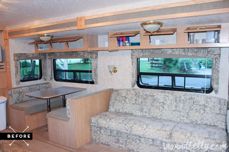
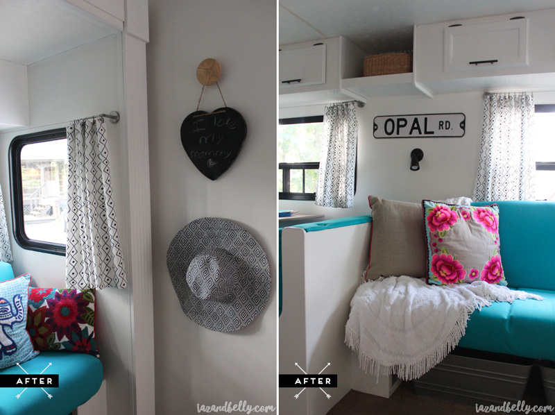
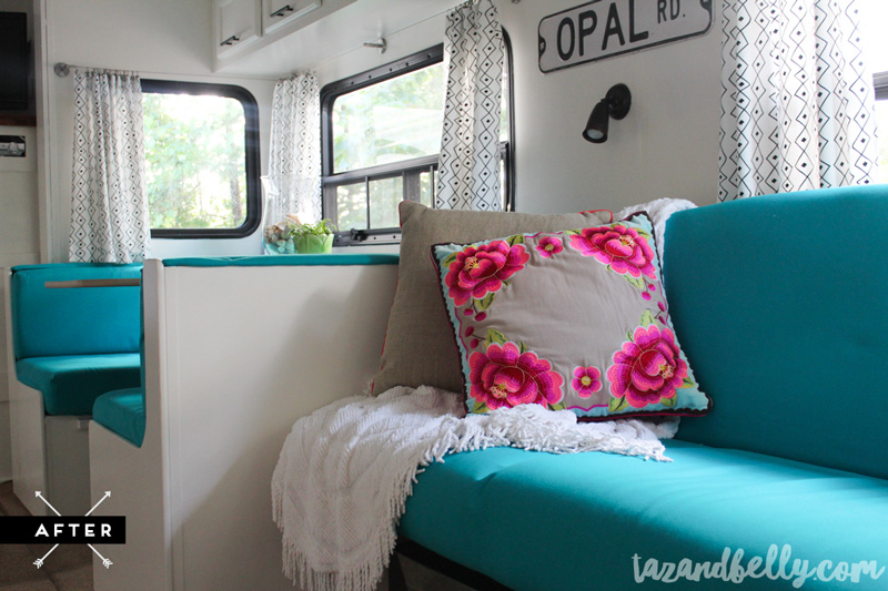
This is one of those spaces where the tiniest of details make the biggest impact. I replaced that brass walk sconce with a directional reading lamp. The sconce never worked properly and it was just plan ugly! Now I can read on the couch without having an overhead light on. The ceiling fixtures here were also due to be replaced. I searched high and low for another option, but most camper fixtures looked exactly the same in a different finish. Since camper lights work on a different voltage than the ones in your house, you have to be careful about what you order to replace them. I ultimately got out my spray paint and gave the brass “boob lights” a little makeover of their own. Sure, I would prefer something more modern, but they mostly disappear!
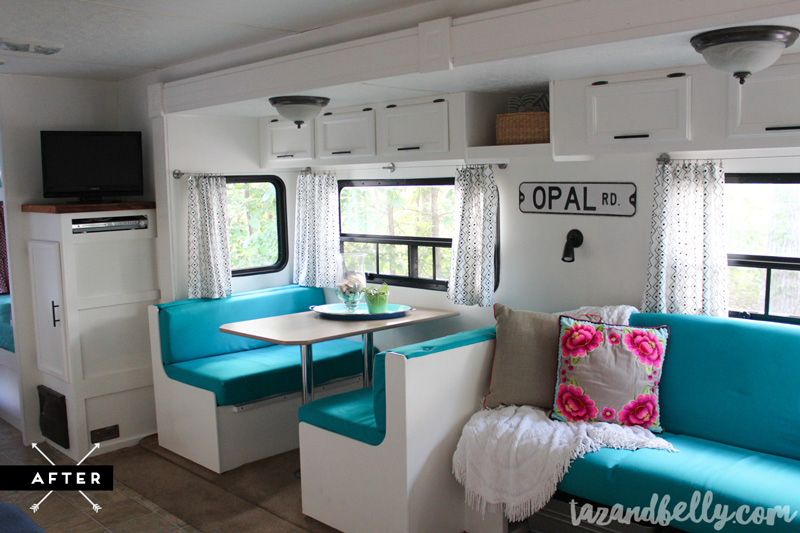
turquoise duck cloth fabric | tablecloths turned curtains via ikea (no longer available) | curtain hardware | similar wall sconce | vintage chenille throw (similar options on etsy) | vintage throw pillow | vintage street sign | cabinet hardware
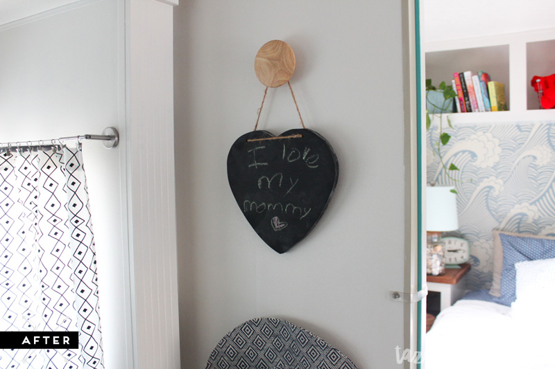
Sophie made me this chalkboard for Mother’s Day and it’s one of my favorite thing ever! I found these Target wall hooks at my beloved Bargain Hunt and they were the perfect size to fit between the slide out and the wall when our camper is closed.
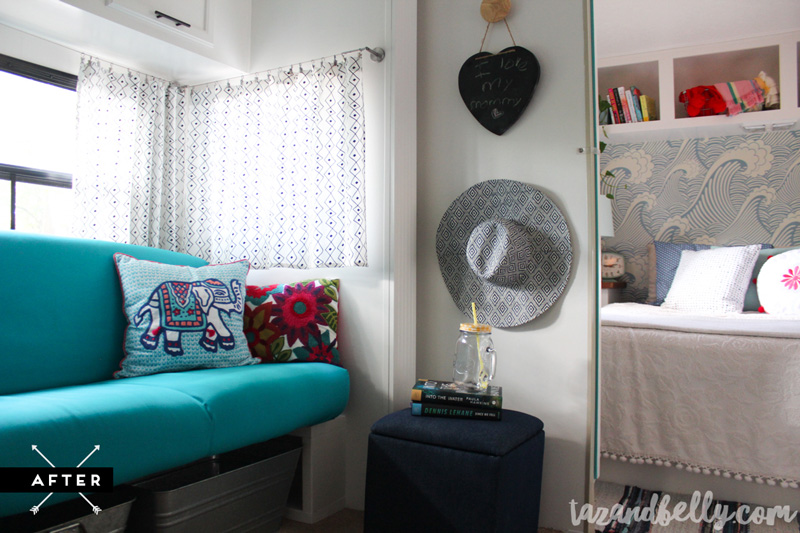
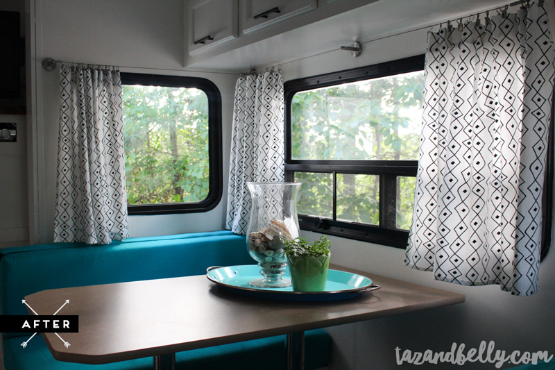
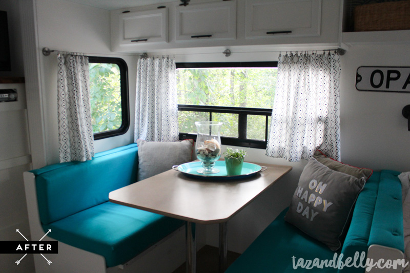
We used blackout roller shades in our bedroom (we’ve bought them for the girls room, but haven’t hung them yet), but I knew I wanted something light filtering in the living area. I’m fine with pulling the curtains for everyone to change or at night when we don’t want strangers peering in, but I do not want to feel like we’re living in a cave! I toyed around with so many options, but when I found this graphic tablecloth from IKEA back in the spring, I knew it was perfect. I cut it into six equal pieces and my mom hemmed it for me. I used a curtain wire system from IKEA and it is so easy to open and close!
turquoise duck cloth fabric | tablecloths turned curtains via ikea (no longer available) | curtain hardware | vintage throw pillow | target throw pillow via bargain hunt | cabinet hardware | similar storage ottoman | wallpaper | wooden wall hooks | similar galvanized storage bins
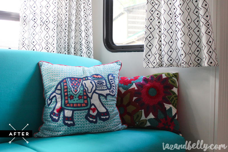
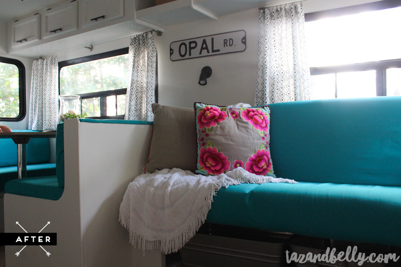
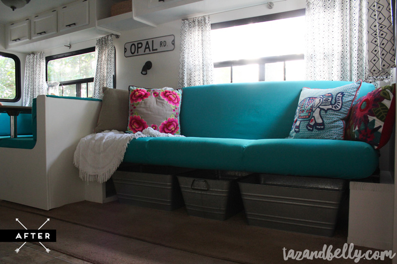
My mom sewed giant slipcovers for the dinette pillows and the couch. I love that they can easily be removed to wash, but the fabric is durable enough that it might not have to happen. We decided not to put the panel back on beneath the couch, but I hated being able to see underneath the couch when you opened the camper door. I found these huge galvanized tubs at Walmart for a steal! I tried linking the exact ones, but I can’t find them on their website. JUST GO already.
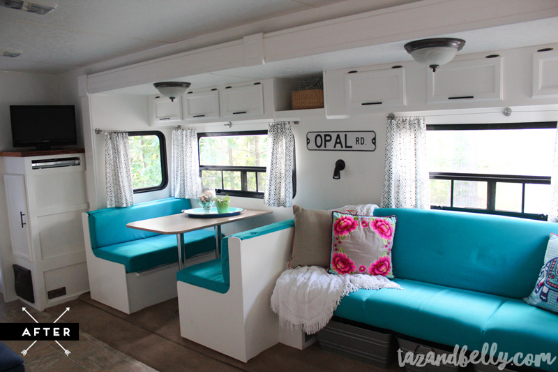
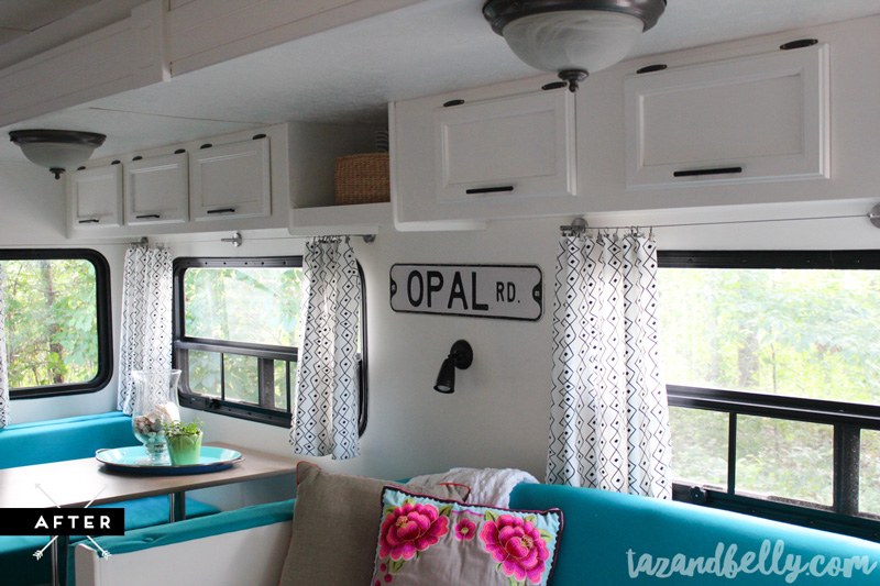
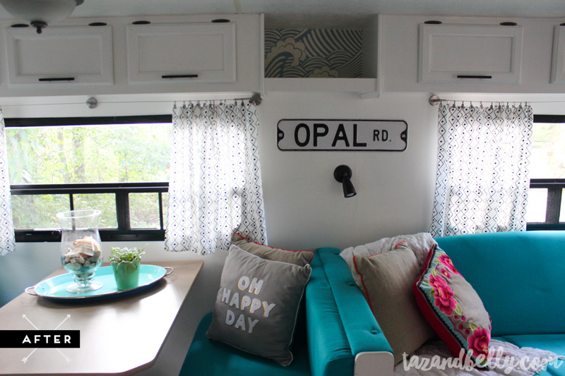
I stuck a basket up in the cubby between the cabinets as a catch all for the things that don’t have a home. Since I had several scrap pieces of wallpaper left over from previous projects, I decided to add a piece to the back of the cubby, too. It isn’t seen very often, but I love how all of the pieces relate back to one another.
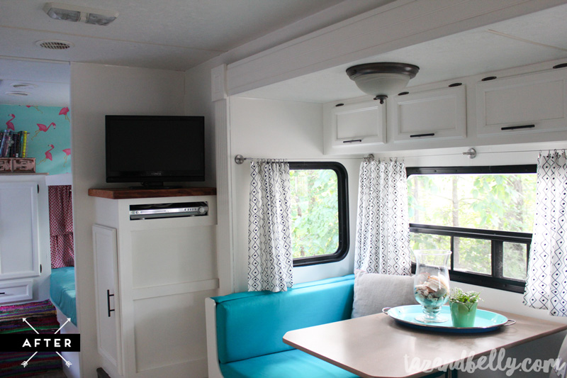
Here is a close up shot of the entertainment center area. My dad made another barn wood top for this cabinet, too! I’m secretly hoping I can convince him to make countertops and a dining table to match.
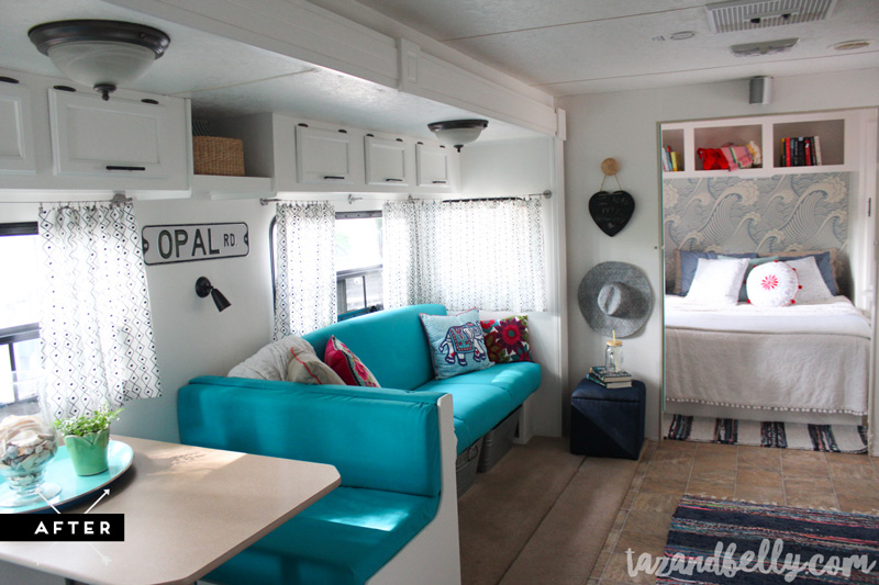
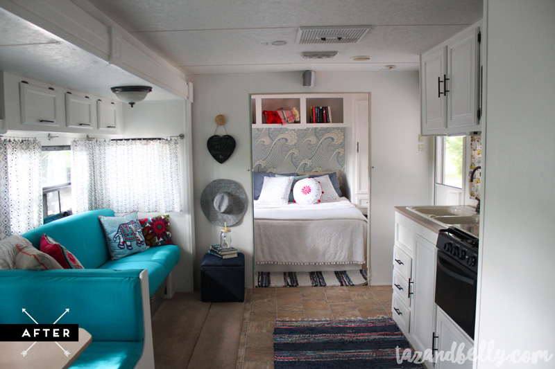
This is my favorite view of the entire camper. I love being about to see from one end to the other and seeing all of our treasures and favorite pieces. I can’t wait to spend all of my summers here.
Thanks so much for visiting and reading today. I would love to hear what you think about our camper tour in the comments and it would mean so much to have you share today’s post — or any post in this series — on Facebook or Pinterest. We have had so much fun transforming our summer getaway and I want to share it with as many people as possible!
Final Camper Reveal | Master Bedroom Reveal | Kitchen Reveal
