Affiliate links appear in the following post. Although shopping the embedded links won’t cost you any additional dollars, it might earn me a small commission on sales. Your support of this blog is much appreciated!
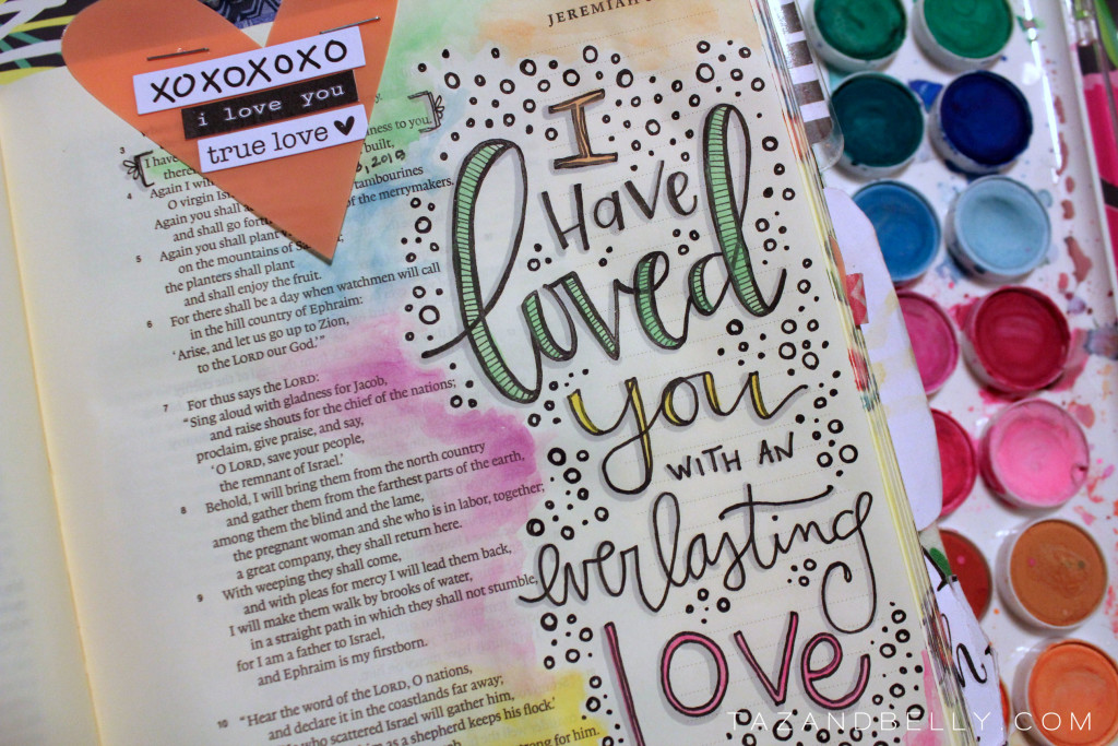
I had something completely different planned for today, but as I was working in my Bible last night I had a change of heart. I thought it might be better for you to see the clear steps that I take to complete a page. I used almost all of the same supplies from the Who Am I page, but took photographs of each step so you can see how I layer the supplies to get the finished look.
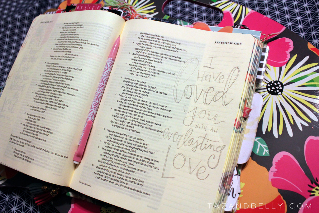
Pencil Sketch First up is the pencil sketch. Using an inexpensive mechanical pencil, I drew a very light sketch of the verse I wanted to illustrate. Once I have a very general drawing on the page, I go back and layer more pencil to fully flesh out the letters until I like each form. For some letters, I add dimension to make them look like bubble letters. On others, I thicken the down-strokes for a “fake calligraphy” look and on others I leave them very simple letter forms.
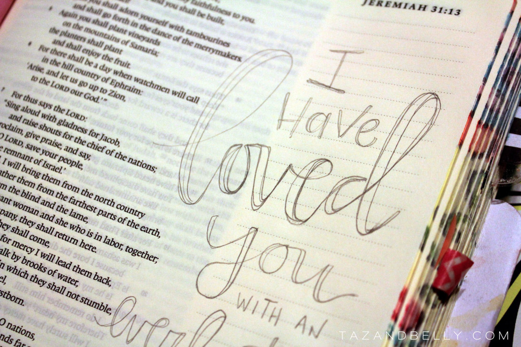
Pen Drawing Once I am happy with the shapes of each letter, I go back and draw them with a single pen line. Here I’m using a Staedtler, but the Illustrated Faith precision pen would work perfectly (mine are all out of ink)! I didn’t worry too much about details, I just wanted to get the basic shapes of the letters drawn in ink.
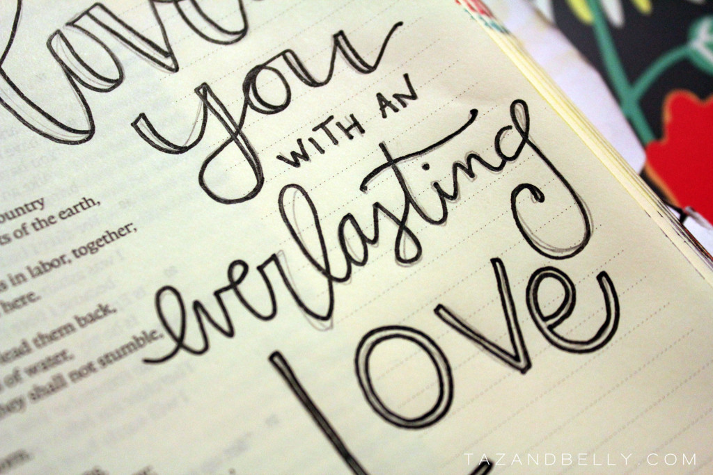
Erase Once the pen lines are completely dry, I erase all of the pencil lines with a white eraser. Several people mentioned to me this week they they are using a standard pink pearl and that they didn’t even know white erasers existed! I’m going to call you lucky if you haven’t had any colored residue on your page, but your day is coming. I definitely recommend grabbing a white one or at the very least, getting mechanical pencils that have white erasers.
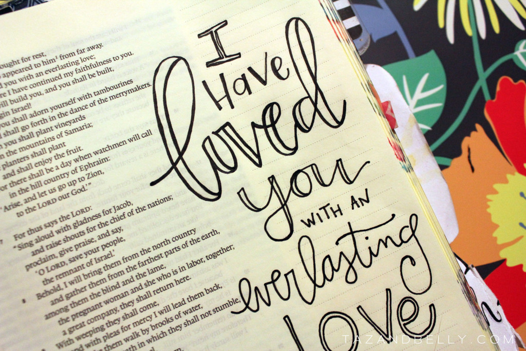
Details Now that all of the extra pencil marks are out of the way, you can see the letter forms much better. At this point, I start adding in some detail to different words and letters — adding stripes, dots or just filling in some of the shapes in black.
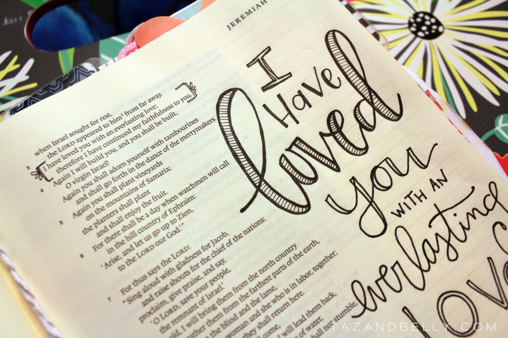
Drop Shadows Before I add any color, I like to use a grey marker to add drop shadows to all of my words. The markers don’t work great over paints, so I put them in first! Just remember to decide where your light source is and be consistent on every letter. My “light” is always in the top right corner of the page, so I draw shadows to the left of and underneath each line.
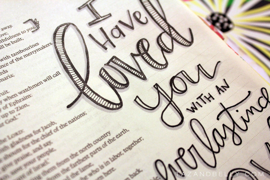
Embellishments Depending on what mediums I’m using and if I add an illustration, sometimes I’ll fill in the negative space with some sort of embellishment. I decided on polka dots here and tried to vary them in size, filling some in and leaving others empty. I really like the movement that it gives the page and I feel like it looks so much more “finished.”
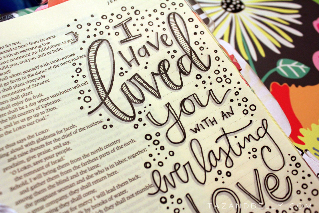
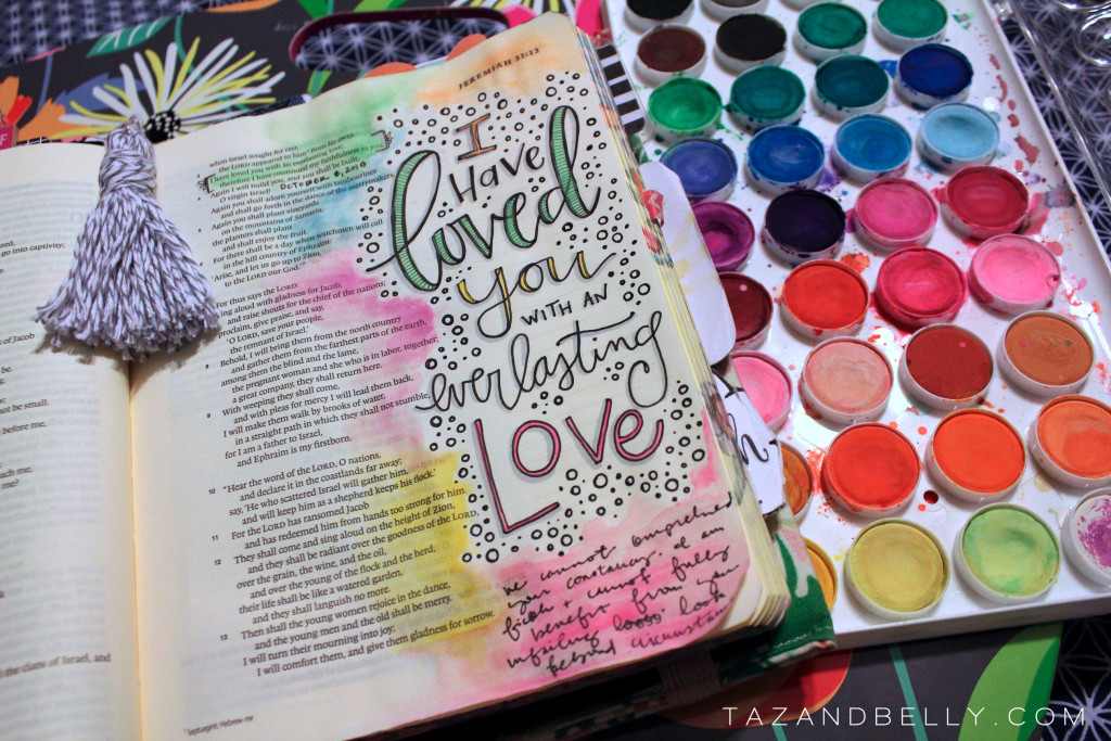
Color There are times when I like to leave verses in black and white, but I’m a huge fan of color, too! More often that not, you’ll find me using these inexpensive watercolors to color my pages. Using an aquash brush, I filled in the bubble letters with some pastel colors and then used them again to add a wash of color around the verse. I wasn’t too precise — I just added concentrated color nearest my illustration and let the color bleed out the further away from the verse I got.
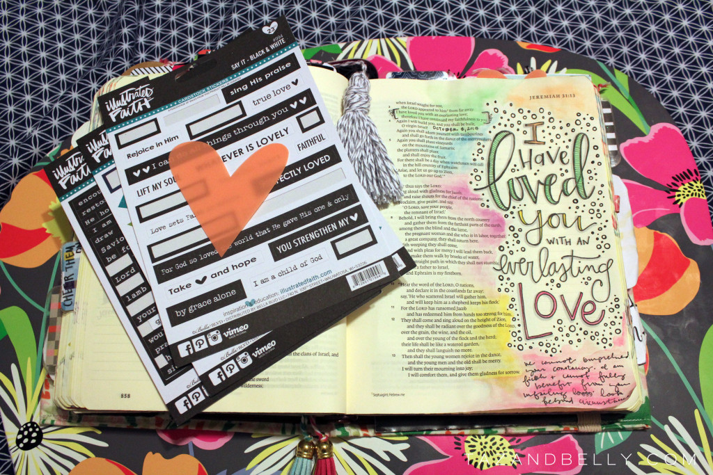
Tabs I get lots of questions about how I make my tabs and if I tab every page and what materials I like to use best. It really varies from day to day, but YES I like to tab almost every page and I can use just about anything to make that happen. Since today’s verse was about love, I pulled this plastic heart from my scrapbooking stash, along with the ‘say it’ and ‘word confetti’ stickers from the Illustrated Faith shop.
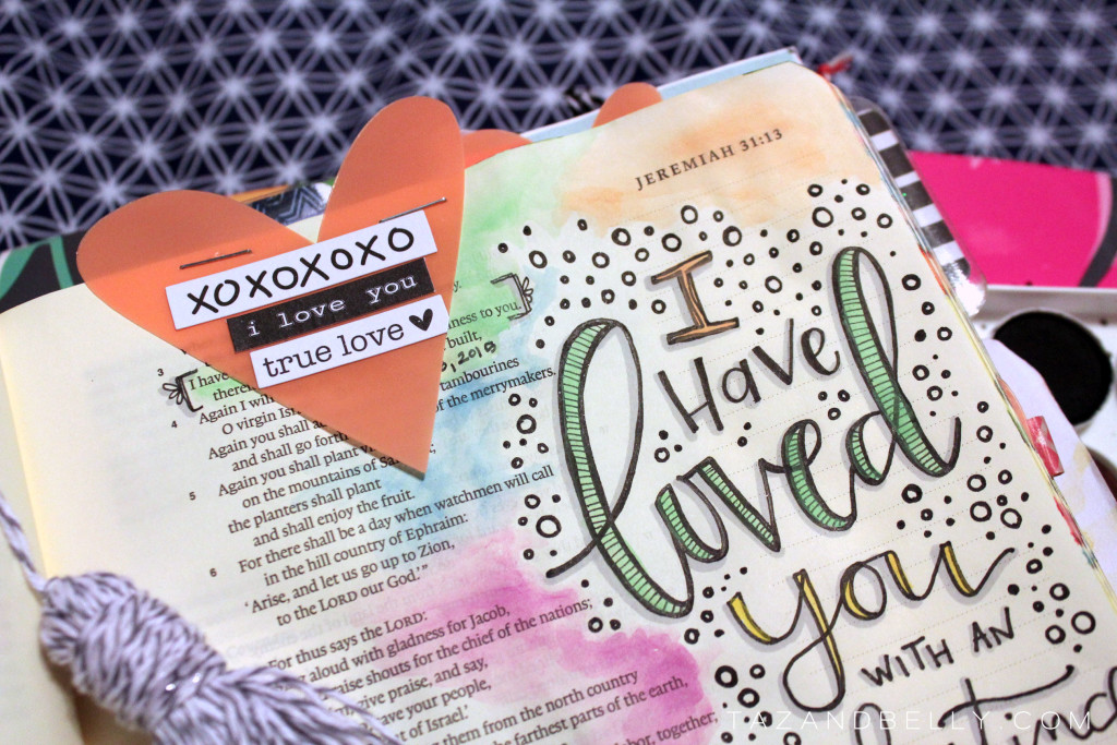
I just layered a few of the stickers on the heart – trimming at the edge when necessary – and stapled it right to the top of the page. It’s hard to tell here, but the heart is transparent and I can even lift it up to read what’s underneath!
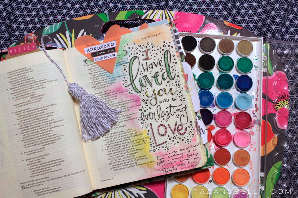
All in all, this page only took about 30 minutes to complete (even though I stopped to take a zillion photographs) and that includes the time I spent reading the verses from yesterday’s Jesus Calling devotional. It is a very simple page that packs a lot of punch – especially with the color wash and embellishments!
Next week, I’ll share a video of a similar process before we move on to using other supplies. Any questions about today’s pages? Sound off in the comments below. Need help choosing supplies to use in your Bible? See my updated supply list here!
My Favorite Bible Journaling Supplies: one column journaling bible | mechanical pencils | pigment liners | crayola twistables | white gel pen | prismacolor marker | white eraser | distress markers | washi tape | craft paint | catalyst wedge | watercolor paints | tab punch | patterned papers | rolling date stamp | black ink pad. For more details about why these are my favorite, visit this post!
