Does anybody know how long I’ve been saying that I would share our living and dining room makeovers? It’s been exactly 6 weeks since we emptied the rooms and gave them a face lift and I’ve finally taken pictures of the “afters” this morning. I wanted this to be one of those projects that was complete inside a month, but I quickly realized how silly that was! We are pretty close to being finished, but I have a few more things to pick up and make and the new goal is to have everything done by Sophie’s birthday party on April 16th!
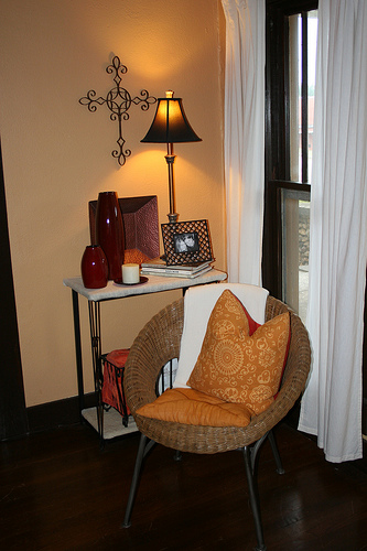
The photographs below were taken in May of 2009 right after we bought new rugs for the rooms. A few pieces of furniture had been moved since then and I’m sure we bought some accessories, but in general, this is what the rooms looked liked just six weeks ago.
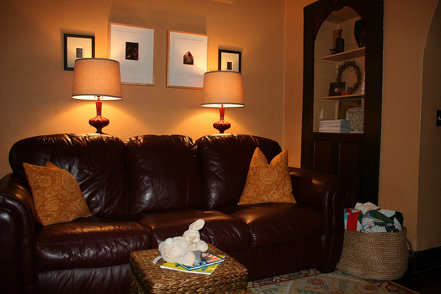
This is the longest wall in our living room and the only one our couch fits on. I would love to have a more modern silhouette — maybe even a small sectional — but not only does the layout of this room not work for that, the leather couch and chair are beyond practical for our busy family. Maybe in my next life I can have white sectionals!
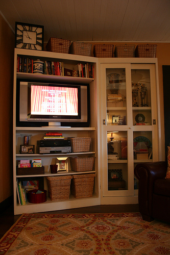
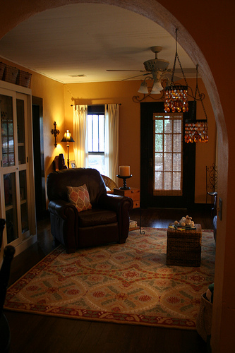
The photograph on the left shows my favorite piece of furniture which we had used as an entertainment center since shortly after we got married almost nine years ago. It has been great in this spot, but we were ready for a change. The photograph on the right shows the living room looking through the archway from the dining room. You can see our glass front door from here. The entertainment piece is on the left and the wall with the couch is on your right. Just for a point of reference, our bedroom is through the door to right of the entertainment center and Ella’s bedroom is directly across the living room from ours.
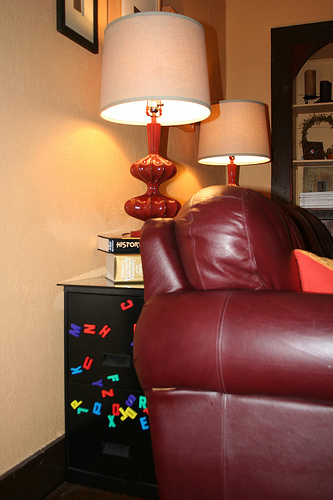
Here is the front corner of our living room — between our bedroom door and the front door. The second picture just shows how we suspended a piece of glass over two file cabinets to double as a console table. Sophisticated, right? We needed the storage and it was a great place for Ella to store craft supplies and play with magnets since the kitchen is so far away.
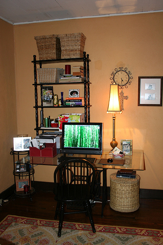
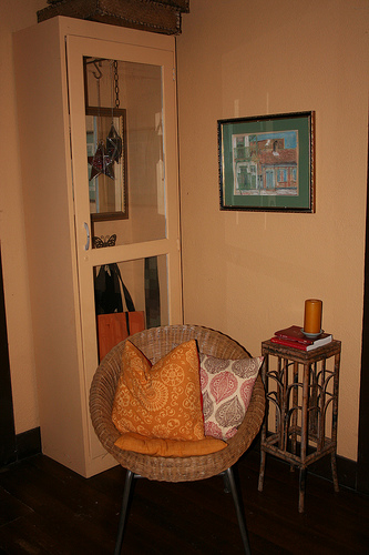
Here is a shot of the computer area and the back corner of our dining room. These areas probably saw the most changes of any other walls in the rooms.
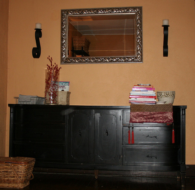
Last up is the piece of furniture we refer to as the “buffet”. In reality, it was Josh’s childhood dresser that was in BAD need of a refinish job when we got married. We painted it high-gloss black and replaced the hardware. It worked well with the dining table and chairs that were also painted black. You need to pay close attention to this piece of furniture!
Some things to note:
- The trim in these two rooms, as well as the doors, were dark brown to match the floors. We didn’t make this selection, but opted not to paint it when we bought the house six years ago. The trim work in the bedrooms has been updated as we decorated those rooms, but these were the last two rooms to go.
- Although the walls look peach in these photographs, it was more of a pumpkin color. Not only have I gotten better at taking pictures in the last two years, but the lighting in these rooms is beyond tricky. Our dining room is in the very center of the house and has no windows. The only natural light in this area comes from the front door and windows. I am considering replacing the kitchen door with a glass one so that the windows in the kitchen will help brighten the space as well. We can add that to next year’s list!
- Do you see how dark it is, in general? I was over that. Beyond over it, really. I was craving natural light and a brighter, lighter, more modern space altogether.
There you have it. The befores. The sad, dark, depressing befores. I promise to show you the really pretty afters on Monday. Have a great weekend.
