To say that I am pleased with the way these two rooms turned out would be a vast understatement. I still find myself sitting around staring at the walls, giddy with excitement. I haven’t spent a single dime on anything frivolous for myself or the girls since the first of the year and it’s all because I keep thinking of things I want to add here and I’m saving my pennies for a few finishing touches. The “after” is such a dramatic change that Ella comments regularly on the fact that we “live in a different house” and everyone who stops by can’t believe its transformation. It is so BRIGHT in here now and I can actually take photographs without a flash. I feel like we’ve been living in a dungeon for the last six years and we’ve finally been let out!
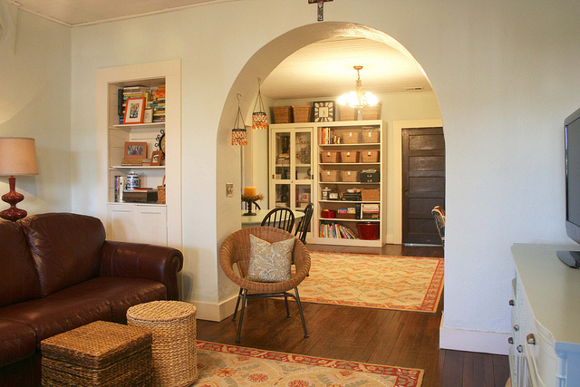
This is the view when you come in the front door, looking back into the dining room. Before that room was barely discernable from this vantage point and now look at it.
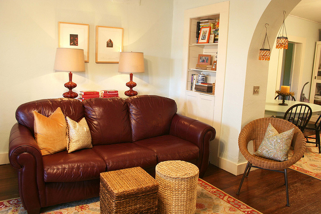
The couch and woven ottomans are still in the same place, but they look so different against the new wall color. Before, the furniture looked almost purple, but now it is a much browner burgundy. Does that even make sense?
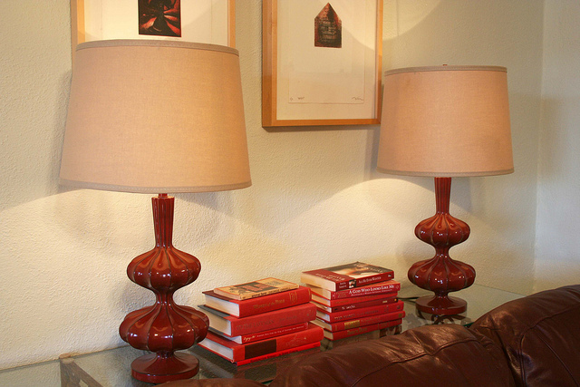
I’m using two of the four prints that hung on this wall, they were both intaglio prints created by fellow art students my junior year of college and my grandmother had them custom framed for me as a wedding gift. I love these lamps and barrel shades I got at Pier One and I paired them with a few stacks of red books on the console table.
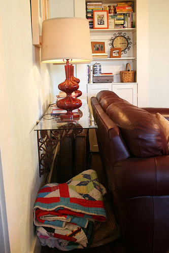
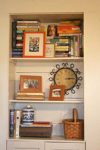
Speaking of the console table, Josh mounted two iron brackets on the wall and I love it! Not only are they high enough that the lamps are finally in the right place, but we can store a few things behind the couch to keep the room looking less cluttered. We have a basket of floor cushions and a big basket of quilts and blankets. These items are still accessible, but they aren’t sitting in the middle of the floor. The built-in bookcase got a facelift, too, with a fresh coat of creamy paint and some new accessories. I absolutely LOVE how the books look all stacked in here together. I was originally going to paint that orange frame another color, maybe gold, but I actually like how it looks paired with the colorful books. That little basket on the bottom shelf holds extra coasters and our remote controls. I’d really like to find a nice vase or bowl to put there instead, but it’s working for the time being.
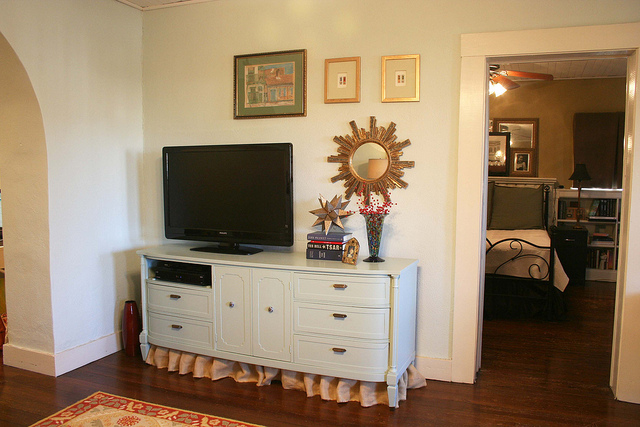
This wall is probably the biggest transformation of all. Before the piece of furniture on this wall was so large that it made our television look tiny and really made the room in general appear much smaller. We swapped the bookcases for our buffet and gave it a makeover of its own. Josh suggested removing one of the drawers to hold our satellite box and DVD player and I love how uncluttered it makes the top of the cabinet. I was completely inspired by the collage wall in this post and decided to hang artwork around the television to make it look less utilitarian. I’d like to continue adding pieces to this wall and maybe the wall to the left, but this was a good start.
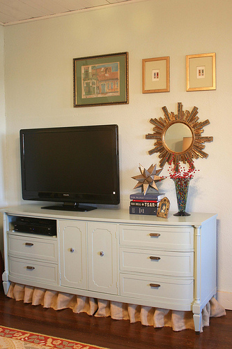
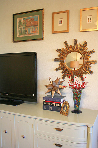
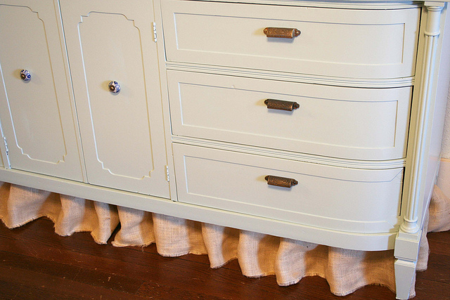
We painted this piece of furniture a similar color to what is on the wall, but the walls were the lightest color on the fan deck and the furniture color was the darkest. It’s hard to tell in the photographs, but there is a subtle difference and the semi-gloss finish on the furniture really makes it stand out. I picked out blue and white chinoiserie pulls for the doors and brass bin pulls on the drawers. I think the total for the hardware was under $9. I love how this piece is footed and I tried several treatments for the space underneath before settling on the skirt. I hated being able to see the plug and baseboards underneath and I couldn’t make baskets or floor pillows look good either. Instead I cut a piece of burlap 12 inches wide and started pinching and stapling directly to the bottom of the dresser. I really like the contrast and texture and now I can put a few baskets of movies, extra cords and cables underneath.
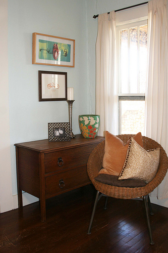
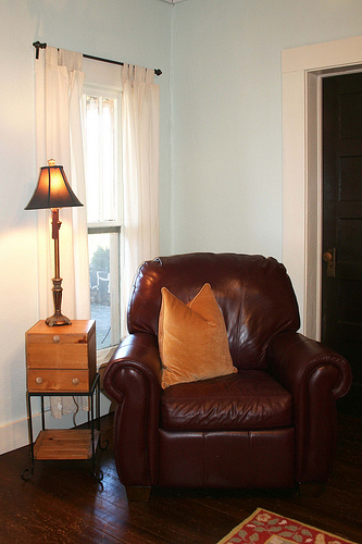
Below we have the front two corners of the room — these areas flank the front door. On the left I swapped out some artwork and moved a chest from our bedroom. It used to have a mirror on top of it, but we removed it and put it in our bedroom to make this piece of furniture look less like a dresser. It is also the perfect width to hold wrapping paper, so I finally have an organized wrapping station right in my living room. I still need to buy a plant to put in the green planter, but I’m waiting until a little later in the spring season. I think I want to buy a small fiddle leaf fig tree and TRY to keep it alive. The corner to the right houses our leather chair and a small pine box table I bought in college. I still want to find a round, convex mirror {but not a $500 one!} to hang on this wall and change out the curtains. I’m thinking I’ll mount woven shades on these windows {and the glass front door} and then make curtain panels out of bold blue ikat fabric.
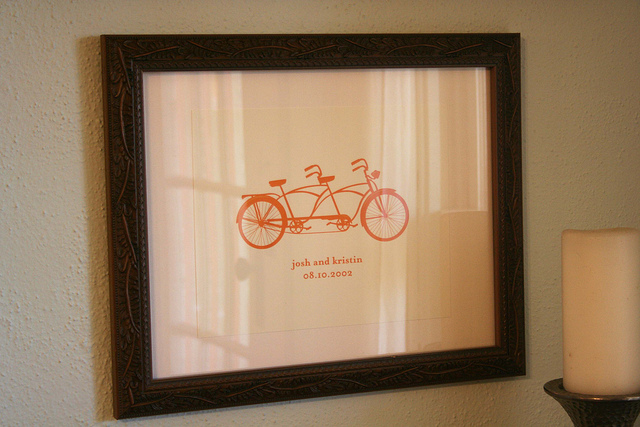
I’m really challenging myself to fill my frames and walls with more original artwork and quirky pieces to give the room a young, fun vibe. I ordered this print from etsy for myself for Valentine’s Day. I thought the tandem bike in this poppy color would look great on our blue walls and I had it personalized with our names and wedding date. If that isn’t quirky, I don’t know what is.
I guess it’s time to take a walk into the dining room. The two hanging lanterns in the archway were an early purchase in our marriage. They hung in our first house and have been hanging here since right after we moved in. I had to laugh because I washed the votive cups in the dishwasher the weekend we painted and I’m guessing it was their first bath ever. It was not a pretty sight! I love how they look in contrast to the blue walls and the little wicker chair adds some much-needed seating without taking up too much room.
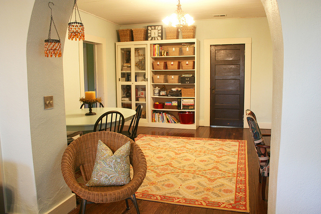
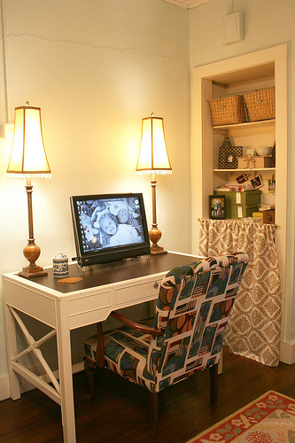
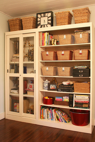
You’ve already seen my little blogging corner, but I’ve added a few accessories and gotten a little more organized since the last time you were here. I’d still like to find an office chair to put here that will be more functional and maybe on wheels. There is room for the upholstered chair somewhere else in the room. Putting the bookcases on this back wall really turned out to be a huge success. I’m storing unused decorative accessories in the big boxes on top and I’m using the smaller boxes and bins to store all of our craft supplies within easy reach of the dining room table. We saved the lowest two shelves for Sophie and stocked it full of blocks, books and toys since we knew she’d be emptying these shelves on a regular basis anyway.
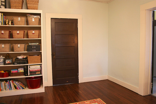
This is what the rest of the bookcase wall looks like. Vacant. This door goes into our kitchen and I’m hoping to convince Josh to swap it out with a glass one to help with the natural lighting in this room. The rest of this corner is still up in the air, but I’m considering ordering one of these hanging bookcases for the right-hand wall and moving the upholstered chair here once it is replaced as a desk chair.
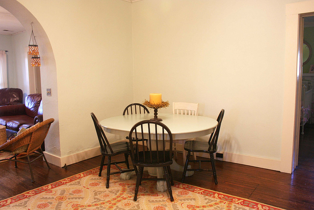
Here is where our dining room furniture wound up. It fits so much better on this wall and allowed enough room to add the leaf and a fifth chair. I plan to repaint all of the chairs with navy high-gloss paint in the next few weeks. I’m hoping it will still give us the dark, grounding color we need while coordinating a little better with the room as a whole. I also hope it will help the orphaned chair fit in a little better until I track down another windsor backed chair. The table got a coat of the same blue paint as the buffet and I love how it looks. My plan for the walls is a poster-sized family portrait on canvas for the small wall and twelve white frames on the larger wall. I think I’ll mix in some black and white photographs of the girls with some of their artwork and rotate the pieces as they bring new creations home.
Here we are looking back towards the front door — where we’ll finish our tour. I am so beyond thrilled with how the rooms work together and how completely different everything looks. I got rid of so many things that didn’t need to be here and the whole things feels so much lighter, brighter and less cluttered. I’m trying to be more deliberate about my purchases instead of finding a home for every little thing I’ve accumulated in the last thirty years!
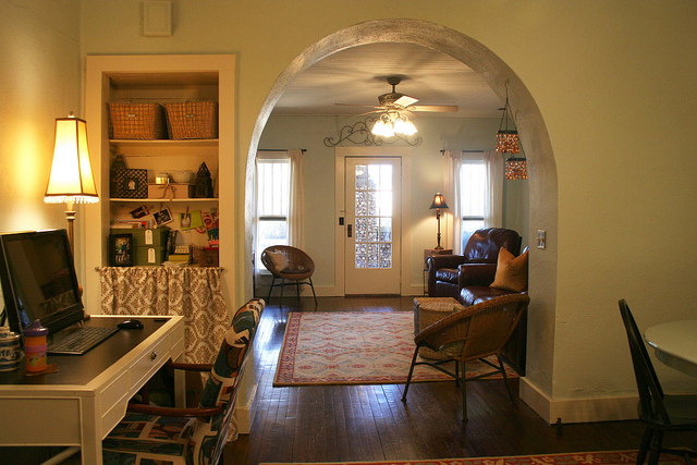
Ummm, how did that sippy cup sneak in my picture?!
Well, what do you think? I would still like to paint all of the bedroom doors to match the trim, replace the curtains and add shades, change out the switch plate covers to cream ones and purchase some new frames and throw pillows. I’m so glad to be 95% finished though and feel like I can relax in my own home again. It was starting to look a bit like an episode of Hoarders around here!
